How many times have you scrolled through your feed and not once stopped because nothing caught your eye, then that something did. You know what I mean, that image grabbed your brain and said, "LOOK AT ME!!!" You then complied and looked. What probably caused you to stop scrolling was the composition of the image. It spoke to you and conveyed an interest that you wanted to explore more. Everyone is drawn to different styles but they all are pleasing and yes, sometimes when these rules are broken they are still pleasing. So let us explore what makes those rules work...
 Rules of Thirds
When people think of composition rules, the first one to come to most minds is the Rule of Thirds. It is exactly what it says. Take your view and divide it in to 9 equal sections. 3 across and 3 down - thirds. Put your primary elements on the main lines or take it up a notch by placing those elements at the intersection. If it seems off balance to you, try incorporating a lesser element opposite to provide that balance. Many cameras offer this grid option in your view finder. Be sure to review your manual to see if yours is one of them.
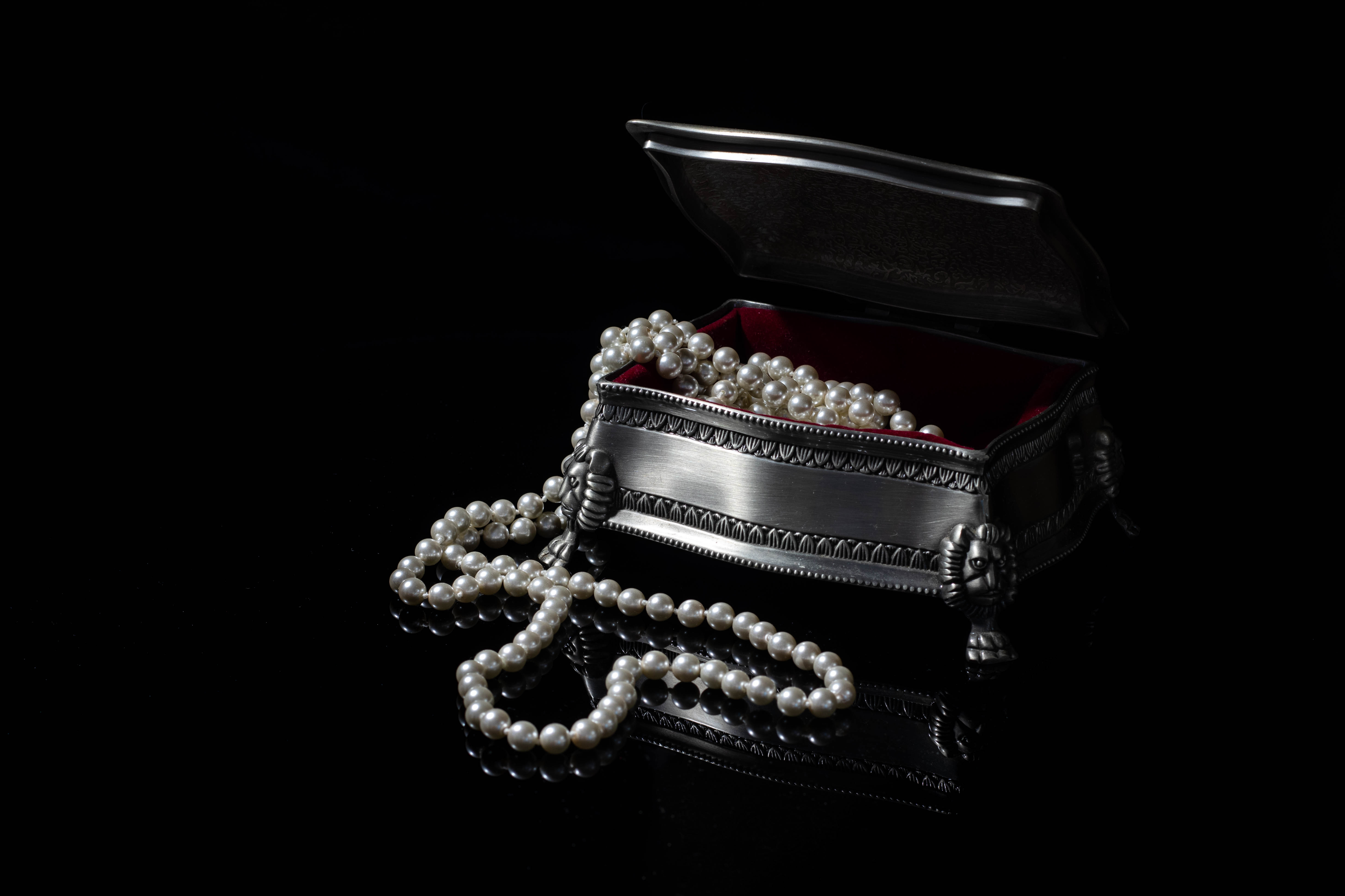
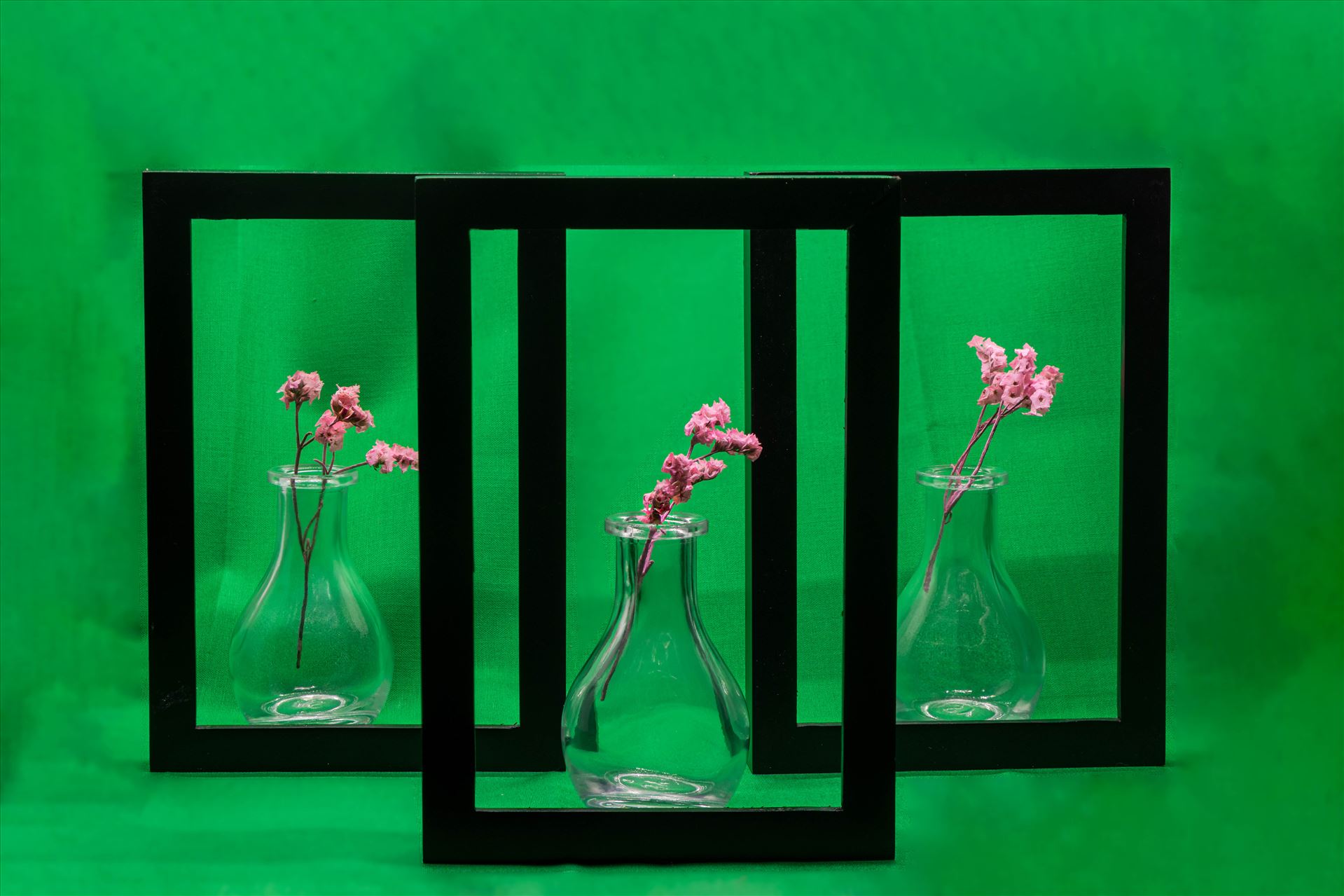
Rule of Odds
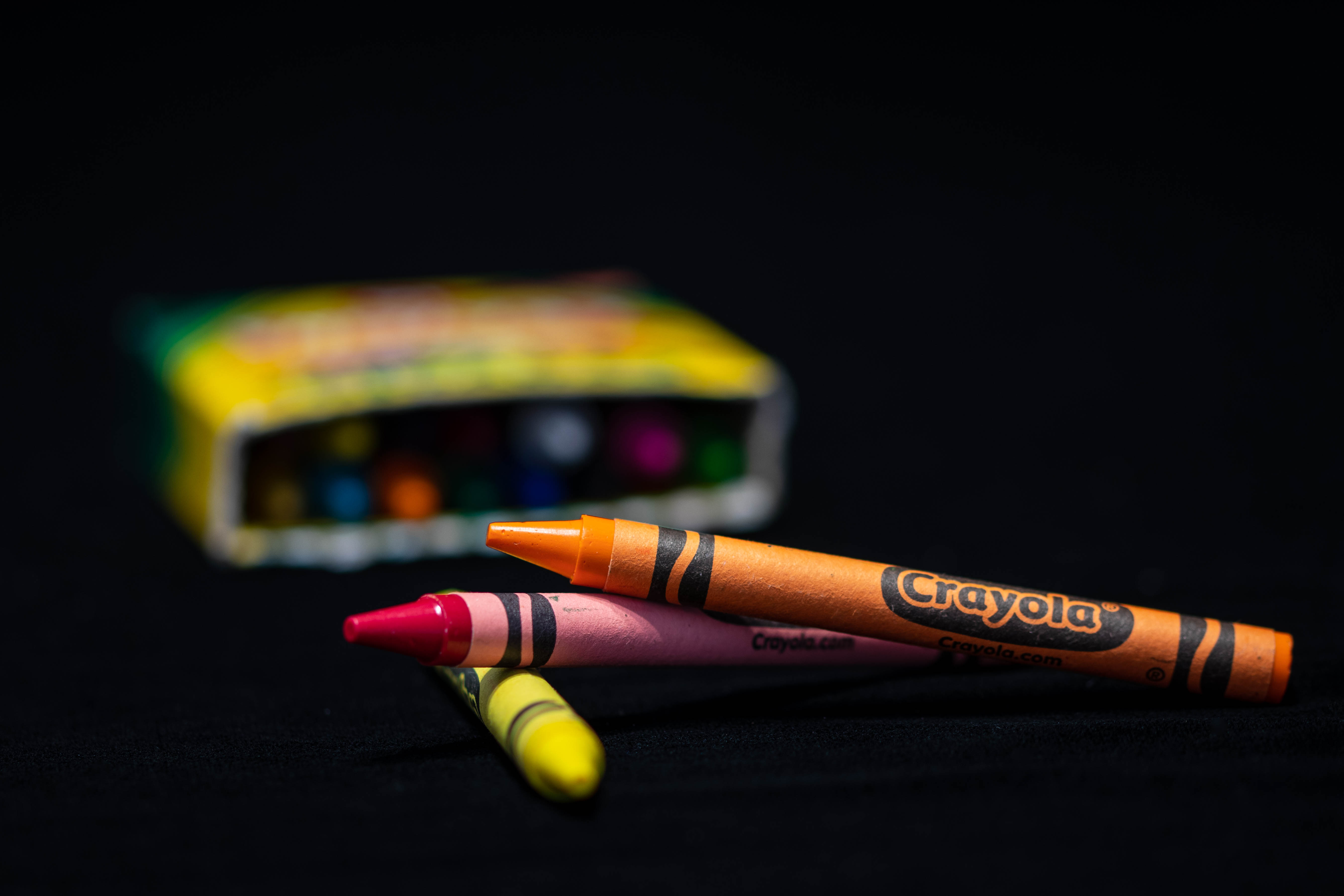
If you would like a simple way to improve your composition, resort to the Rule of Odds. Simply, the Rule of Odds is using an odd number of elements in your image. As shown in the image above with the crayons. The primary elements are the three (3) separate crayons. This rule is fascinating in that just the use of odd numbers makes the image immedialty pleasing to the viewer. It triggers something in our brains that says, "that's better". Unlike the Rule of Thirds, this rule does not require specific placement, just an odd number. You can combine the 2 rules, but it is not necessary.
Golden Ratio
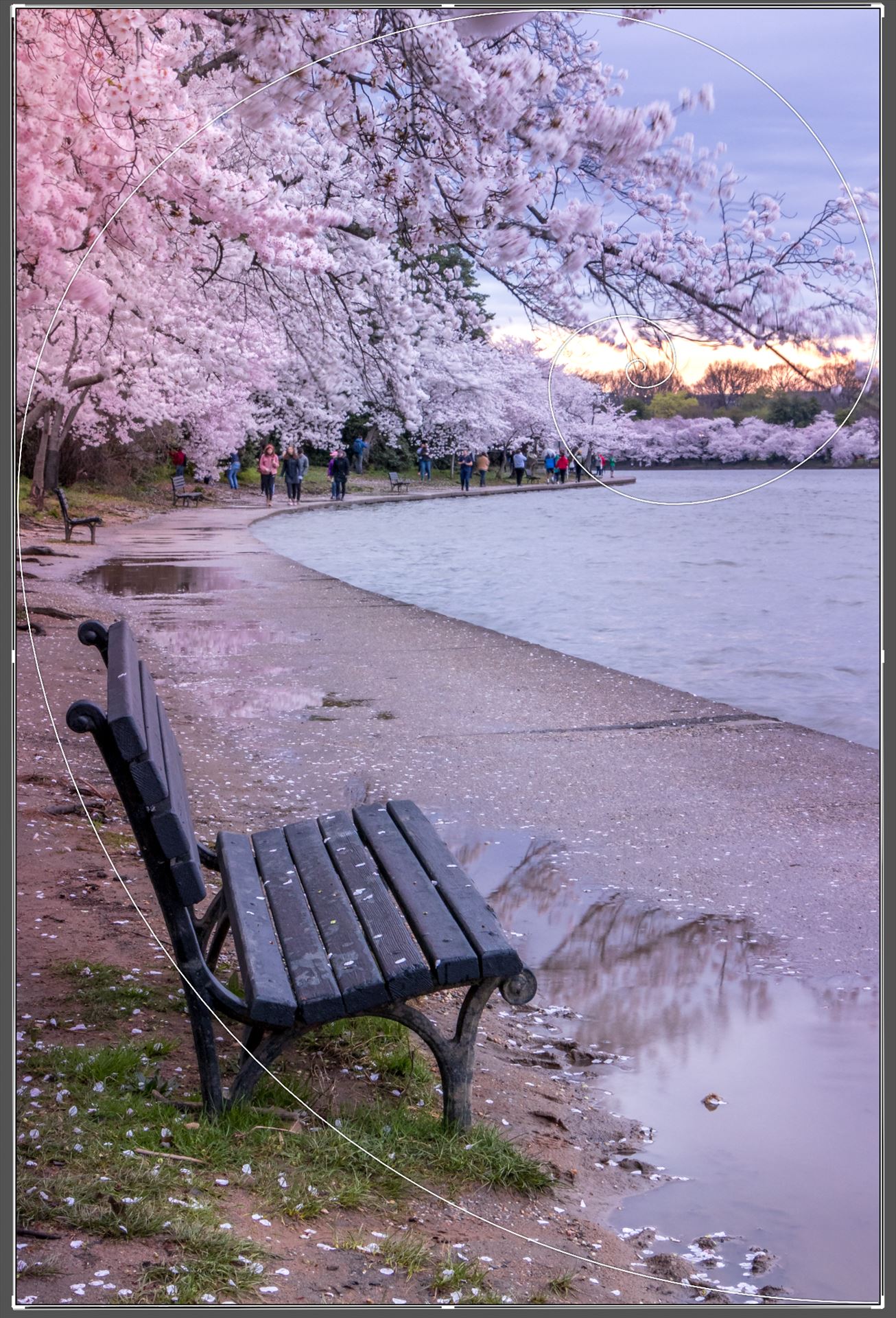
If you look to the image on the left, you will notice a faint white line. That line is a guideline for The Golden Ratio. The Golden Ratio differentiates from the rule of thirds by the balance of the photograph. Here, the focus of the photograph is more in the top left (with more details). The roots of this rule go back centuries and can be found in notable works of art. In essence, it is the perfect balance with the ratio of 1 to 1.618, and you can search for this to understand the proportions in photography, architecture, and art. This rule can be developed in a golden spiral and golden triangles for a more intricate composition.

Leading Lines
Often as we look at an image we subconsciously follow the lines. These have often been framed and positioned by the photographer to direct the viewer's attention to a particular point of focus. These lines are called Leading Lines. These lines frequently guide the viewer's attention in a specific direction or to a specific area of the shot.
Negative Space
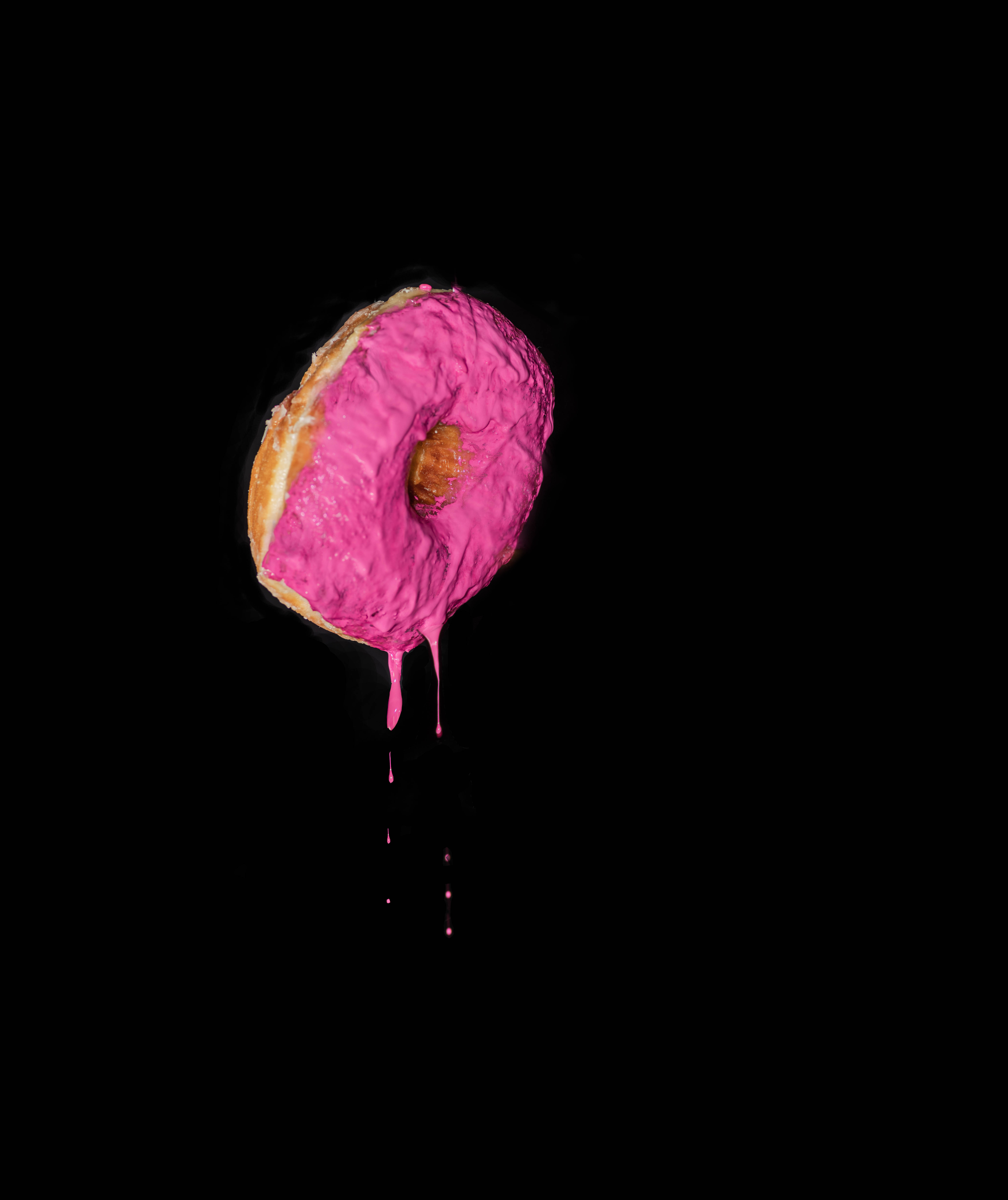
This is not about being a pessimist or a Debbie Downer and showing that in your images. Negative space is simply the name given to the area that surrounds the main subject in a composition. In this image here, the black area reflects the negative space around the donut and its dripping frosting. Singling out your element and enveloping it with negative space should result in a dramatic affect causing that show stopping affect of people's attention. On the downside, our preconceptions on how scenes should be seen can result in images that are not as good as we expected. To avoid this, pay attention to how well the negative and positive spaces work together.

Fill The Frame
Time to make the element(s) of your image center stage. To Fill the Frame means to make the object of your photograph a large proportion of your image. This may require for you to get close. It does not mean you have to shoot in macro, but you don't want the element lost among other things. Just get close and Fill that Frame!
 Symmetry and Asymmetry
The definition of symmetry says it all -"correct or pleasing proportion of the parts of a thing". This could also be balance. What ever you feel it is - it works. Whether it’s a natural subject, human-made, or a reflection, the result will be remarkably appealing for viewers. Try to find symmetrical patterns in unexpected places to combine their inherent beauty with an element of surprise. You can take this rule one step further by using elements that are not equal but rather really similar to each other in terms of color, shape, or texture.
These are just seven (7) rules, some say there are more, some say there are less. Some images have more that one rule that applies. How many rules do you find in the image below. Let me know in the comments below.
Next time we will discuss "Understanding the Exposure Triangle"